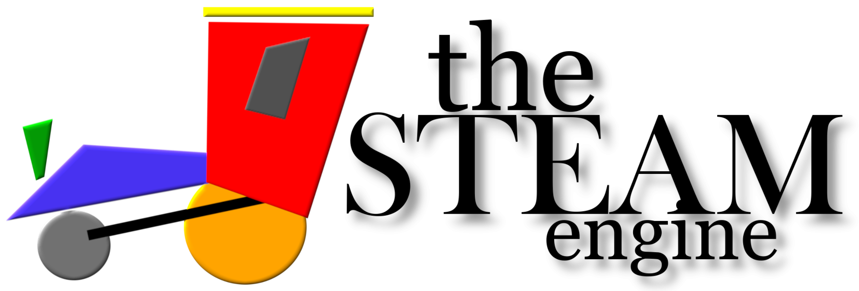
Back when I was forming the idea for this site, I was coming off the back of my original idea. This was called BeingSTEM. I created that site in a particularly hard time in my life, which saw me delete it all and start again. Can’t say why, but that’s how it was. I wanted to create a short post about the makings of the logo. This page, found in the image, below, is what I came up with, at the start. I always wanted a colourful and bold show. These colours were something I had brought over from the old site.
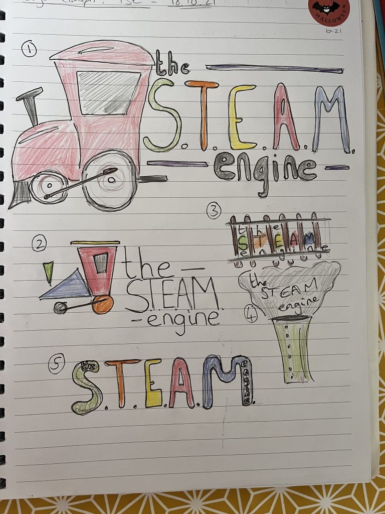
They are meant to represent the colours of the subjects in STEAM. In many respects, they were linked to the particular colours that were found in the school I taught at. For instance, Maths was always blue, as that was the colour of the books that the children wrote in. You can see that I skated a few option, but wanted the toy-like train for it. This would also look good without any text and be linked to what I do. What do you think? Would you have chosen one of the other ones? Planning is essential for the long term goal of a project…you just have to make the time for it!